Project Overview.
What is Entropy Productions?
This wasn’t just another logo project.
This was a passion-led, caffeine-fueled, sunrise-shoot-hustling identity design for Entropy Productions — my very own creative venture built by teenagers, for teenagers, who refused to wait for adulthood to create magic.


The Creative Brief.
The Challenge:
Screams cinematic energy (but politely)
Appeals to young creators without looking like a TikTok trend
Feels premium and professional
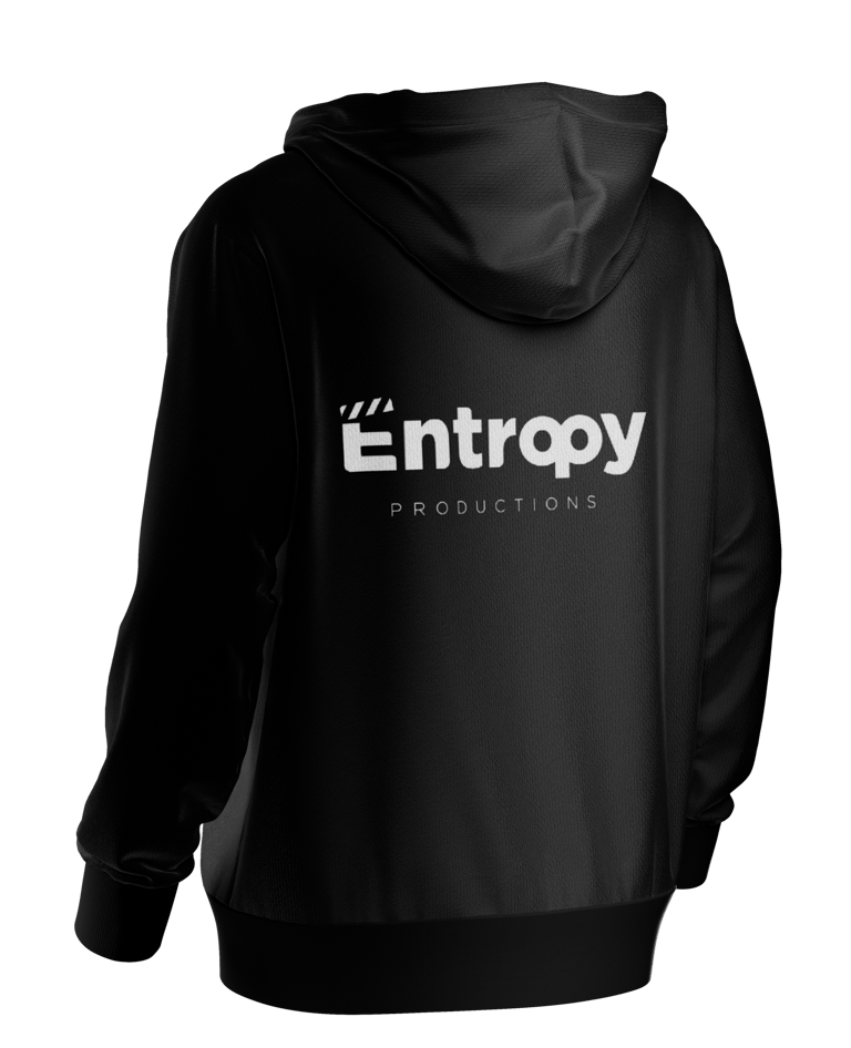
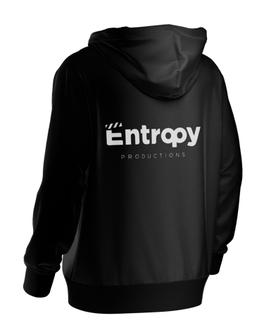
Looks good on everything: YouTube, t-shirts, posters, clapperboards... even dreams

The Concept.
Why “Entropy”?
In science, it means chaos. In creativity? Freedom. Rule-breaking. Doing something so cool, it makes the camera pan twice.
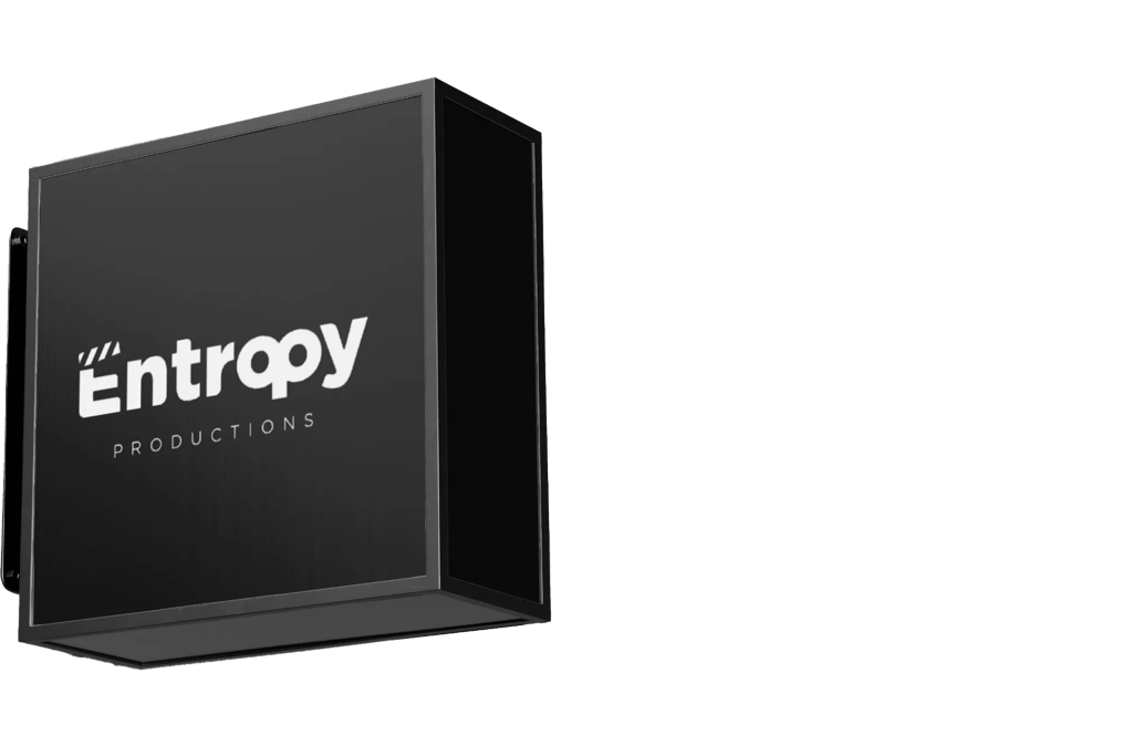
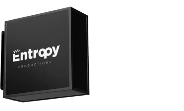
The ‘E’ with a Clap
That stylized ‘E’ wearing a clapperboard hat. It’s bold, iconic, and immediately screams “Lights, Camera, Let’s Roll!”
The clapperboard element on top of the ‘E’ not only cues cinema vibes, but also represents the start of something exciting just like the “Action!” moment in every scene.
Typography
Chose a bold, rounded sans-serif font to capture the vibe of a youthful, passionate team — approachable, modern, and not afraid to be loud.
The roundness of the “r,” “o,” and “p” maintains a sense of friendliness and approachability, keeping things from becoming too rigid or corporate.


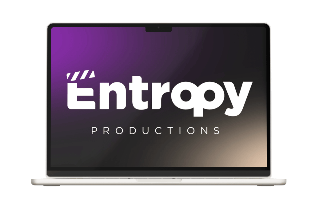
Mockups.

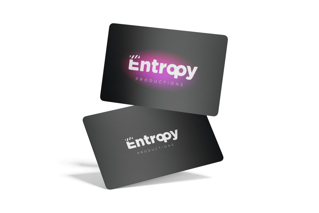
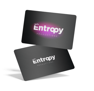
Cards.